Delivering The Rif Care Vibe Page
Client: Rif Care, rifcare.com
Project: Desktop Website Enhancements and Vibe Page Prototype
Goal: Elevate the luxury feel of rifcare.com, and create a user community page where social media posts can be viewed on a variety of topics
Team:
Kristina Larkin: Concept Lead and Project Tracking Consultant
Jess Bellamy: Team and Prototype Lead
Reed Westbrook: Empathize and Define Lead
Phillip Ornelaz: Usability Testing Lead
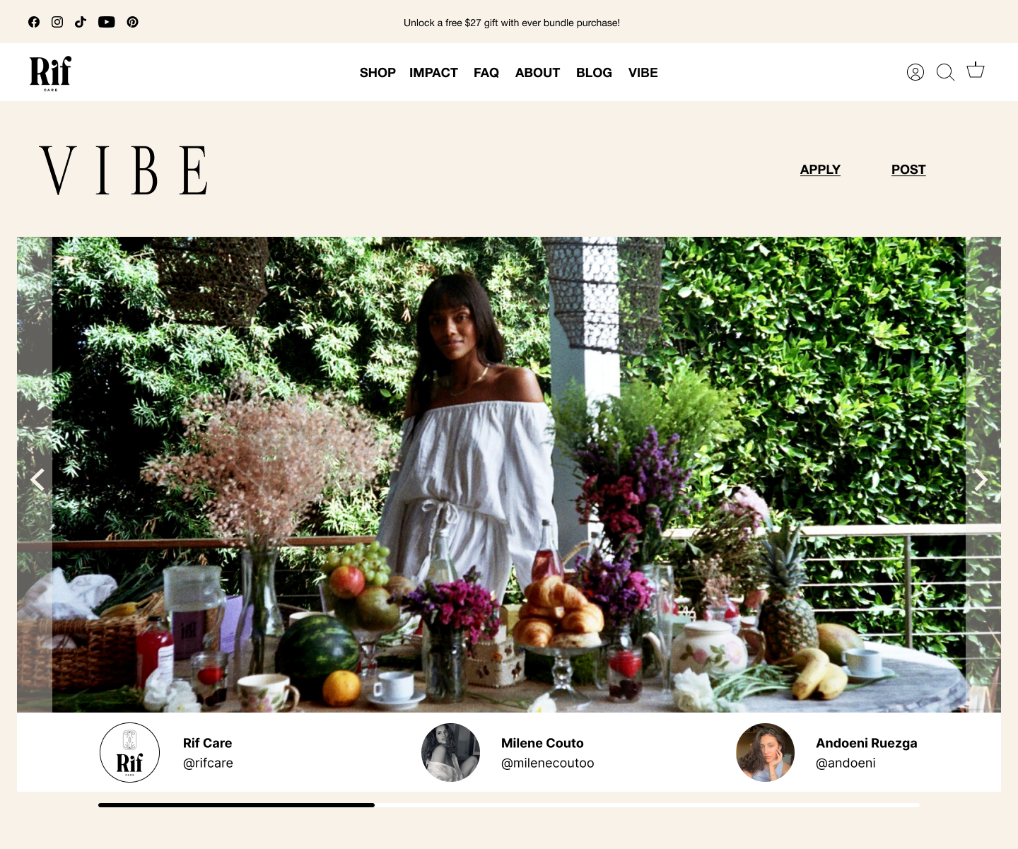
Rif Care's New Vibe Page
Researching to Find Our Personas
For research, we studied organic period care competitors, websites that sold high end products that had a feel of luxury, and sites built on the Shopify Website platform (our client used Shopify for their website). This helped us understand Rif Care’s products and end goals.
To learn about our users, period care product purchasers, we designed two user surveys. These surveys provided insights into their period care purchasing habits, online user experiences and what luxury meant to them.
From our research, we derived two Personas, Sunni, and Z, as well as accompanying problem and solution statements.
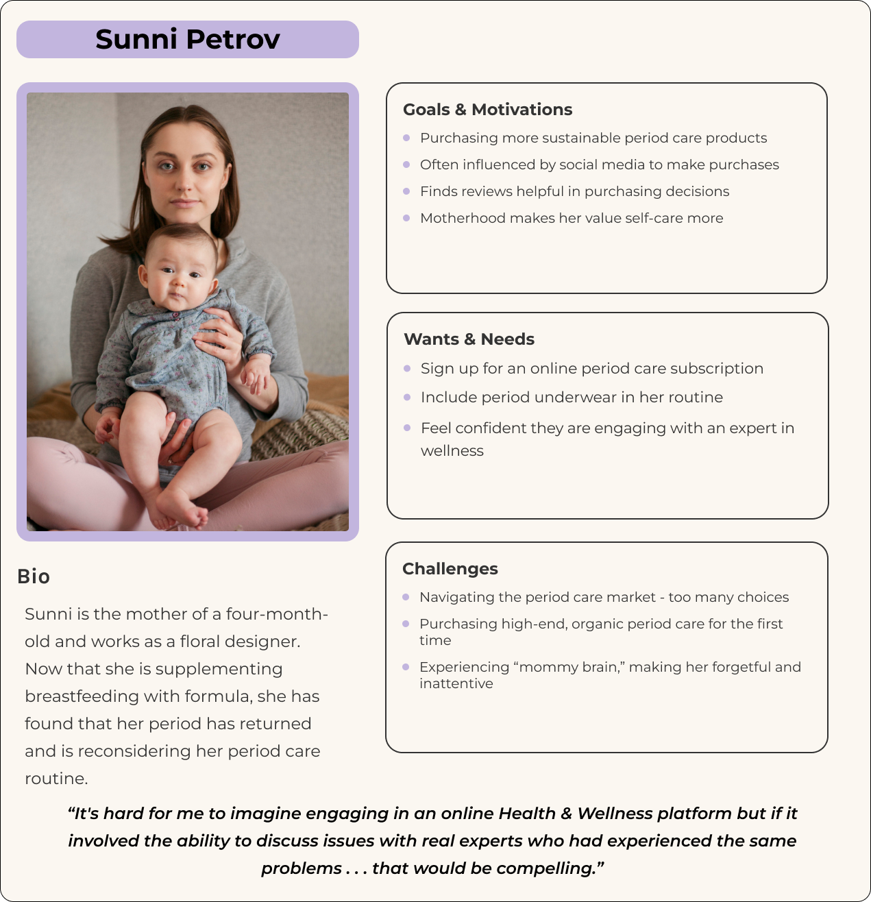
Persona 1: Sunny
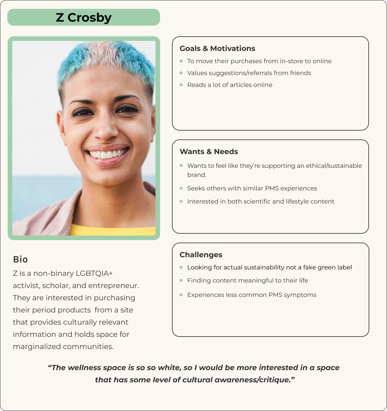
Persona 2: Z
Problem Statement
Our personas, Sunni and Z need period care products with accompanying wellness content because they are both experiencing life changes that caused them to reevaluate their period care.
Solutions
Reinstate the Vibe Page: Rif Care 'Vibe' is a community feature which allows registered members to enjoy interactive content along with others who are on the same journey.
Draw in New Users Through Interactive Content: Allow users to post their own content (with approval).
Elevate Rif Care’s Luxury Image: Design Vibe in the style of a fashion Lookbook, and simplify the site’s color palette by introducing a neutral color scheme with accents of pastels.
Sketching to a Solution
As Ideation Lead, I ran a design studio where everyone submitted sketches for our user flow, with a main focus on sketching out the Vibe Page solution, a community post page where users can submit content about to Rif Care, health, and wellness.
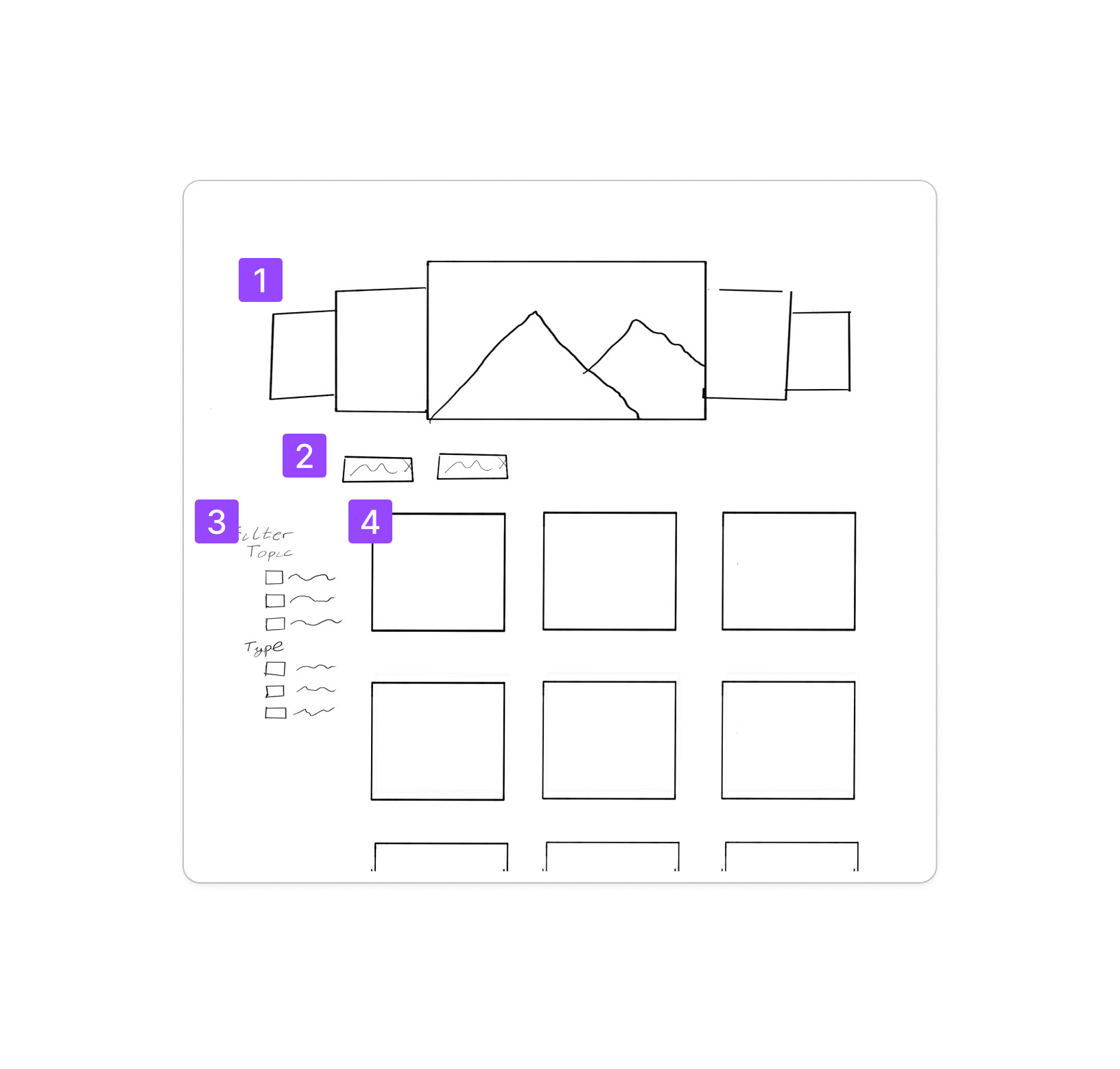
The the sketch below was ultimately selected by the client for the direction we were to go with for the prototype. The clients liked its minimal design and potential ease for developers to implement.
Must Have Elements to the Vibe Page
1. Page Banner
2. Select Post Filters
3. A way to filter the posts
4. Vibe Post Gallery
Building the Vision Out
Our prototype was built in Figma, and featured users flows for visiting the Landing Page, Browsing the Vibe Page, submitting content to the Vibe Page, and viewing the user account page. Below are a sampling of the screens we designed for the Rif Care Vibe Page:
Vibe Page Header Area
1. Vibe Page Header Carousel
2. Link for submitting content
3. Featured Vibe Posts
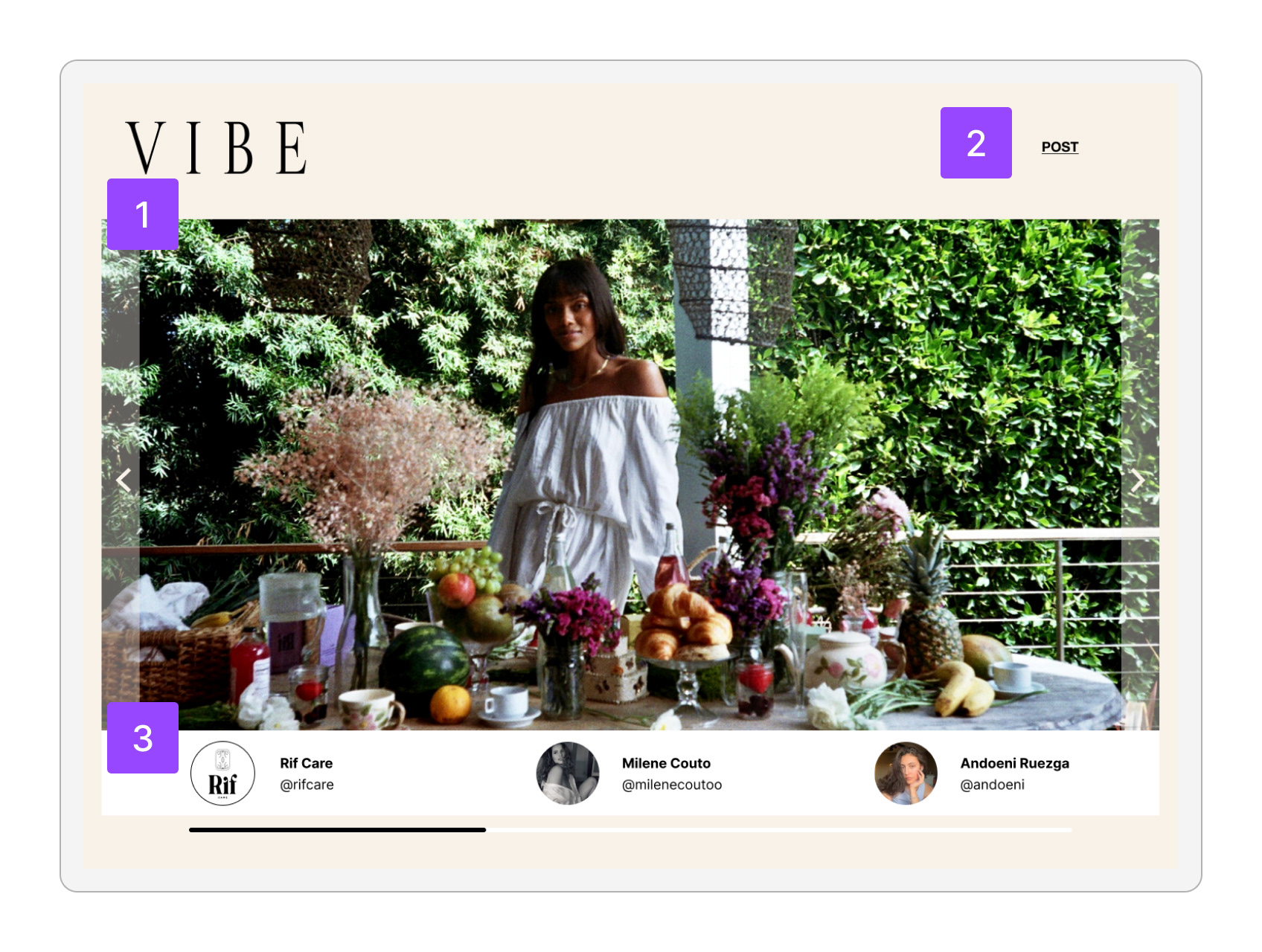
Vibe Page Header Area
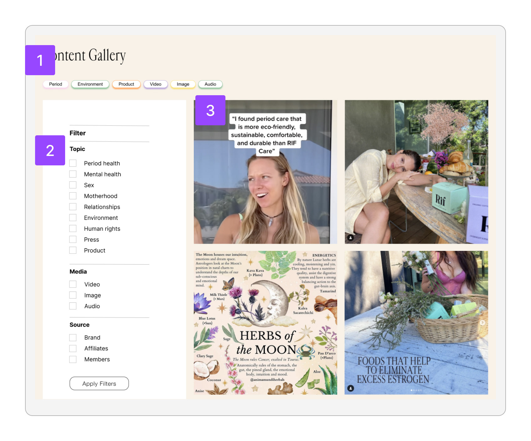
Vibe Page Content Gallery
1. Selected filters
2. Content Filters
3. Post Gallery
Vibe Page
Content Submission Form
1. Form fields for social media info
2. Post preview
3. Topic list for tagging post
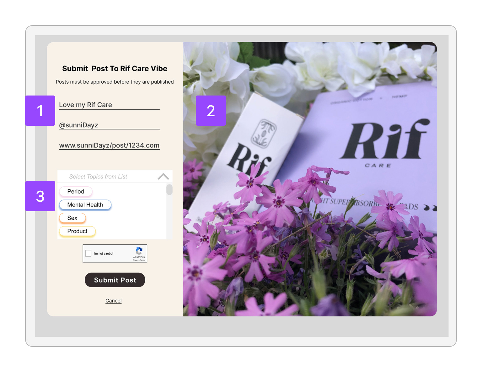
Vibe Page Content Submission Form
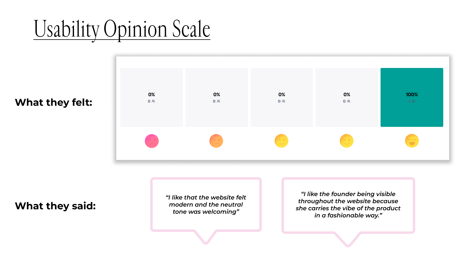
What Do Users Think?
Usability Testing was done through the testing tool, Maze. We asked each participant to browse through the Vibe Page, and to submit a social media post. We also asked users to evaluate the tasks on the ease to complete, and if the experience felt luxurious.
Users had an overall positive experience with the site and completing the tasks:
Delivering to the Client
The project culminated in a presentation that reviewed the journey from project start to finish.
The prototype, and additional deliverables were handed off to the client to give to their team for use on the website.
Interested in finding out more? Reach out here, so I can give you the whole story